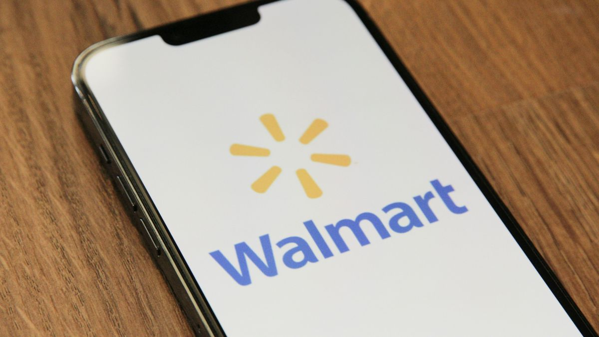
Walmart, one of America’s most recognized retail giants, has given its logo a long-overdue update for the first time in almost 20 years. This refresh stays true to Walmart’s roots while introducing a contemporary twist that aligns with the brand’s evolving identity. Let us take a closer look at what has changed and why this redesign is significant.
What are the key changes in Walmart’s new logo?
The updated Walmart logo has a few visible changes as compared to the one released in 2008.
- Font updating: The whole logo has a new, thicker font, which was drawn from the font that Walmart had used during the 1980s and very early 2000s.
- Dark Blue—a deeper shade of blue that is now associated with Walmart—replaces the lighter blue that was common in previous designs.
- Yellow flame: The iconic yellow spark still resides in the logo symbolizing the innovation of Walmart and energy.
This is by far the most subtle yet impactful redesign, tying in nostalgic nods to Walmart’s past with its bright, fresh-looking appeal.
Why did Walmart update its logo now?
Walmart’s decision to update its logo comes at a time when the company is thriving. Business is booming, and Walmart is drawing in a wider range of customers, including higher-income shoppers. With this success, the company felt it was the perfect time to refresh its visual identity to reflect its growth and adaptability.
William White, Walmart’s senior vice president and chief marketing officer, shared insights about the update: “This update, rooted in the legacy of our founder, Sam Walton, demonstrates our evolving capabilities and longstanding commitment to serve our customers of today and tomorrow.”
Where will you see the new Walmart logo?
You can already find Walmart’s redesigned logo on its website and mobile app. However, this is just the beginning. The company plans to roll out the updated branding across its 10,500 stores over the coming months.
As part of this process, Walmart stores are also undergoing makeovers to create a more modern shopping experience. The logo update is just one piece of a larger effort to align the company’s image with its enhanced offerings and services.
How does this compare to Walmart’s last logo change?
The last milestone update of Walmart’s logo was the transition from “Wal-Mart” to the new logo that included just “Walmart” without a hyphen and with the addition of the yellow spark in 2008. During that time, Wal-Mart was in a real fight to keep pace with the likes of Target.
Today, however, the conditions are entirely different. For one thing, the company’s profits grew by 8% during the last quarter alone, and its U.S. sales shot up by 5%. Walmart has improved, expanded its selection of products, and strengthened its online presence against competitors like Amazon.
What does the new logo mean for Walmart’s future?
This redesign is more than just a fresh aesthetic; it also envisions Walmart’s future. Modernizing its brand while embracing its heritage, Walmart presents itself as committed to remaining relevant and appealing across diverse customer bases.
The new logo is a reminder of the capacity of Walmart to adapt and prosper in competitive retail environments. It signifies, in fact, where the company has been and where it is going.
Continue reading:
Broccoli recall – Walmart takes action over listeria risk in 20 states, find out if you are affected
New law coming in 2025 that will change how Walmart and Target sell their products

